

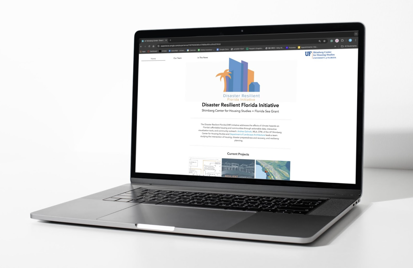
I designed a logo for Disaster
Resilient Florida (DRF) is an initiative
that studies the intersection of housing, disaster preparedness and recovery, and resiliency planning throughout the state of Florida. I utilized a bright color palette inspired by the University of Florida colors
to reflect the connection to the university without directly associating it with UF. The silhouette of buildings, houses, and palm trees represents the type of communities DRF works to protect.
Disaster resilient florida initiative
deliverables


Process
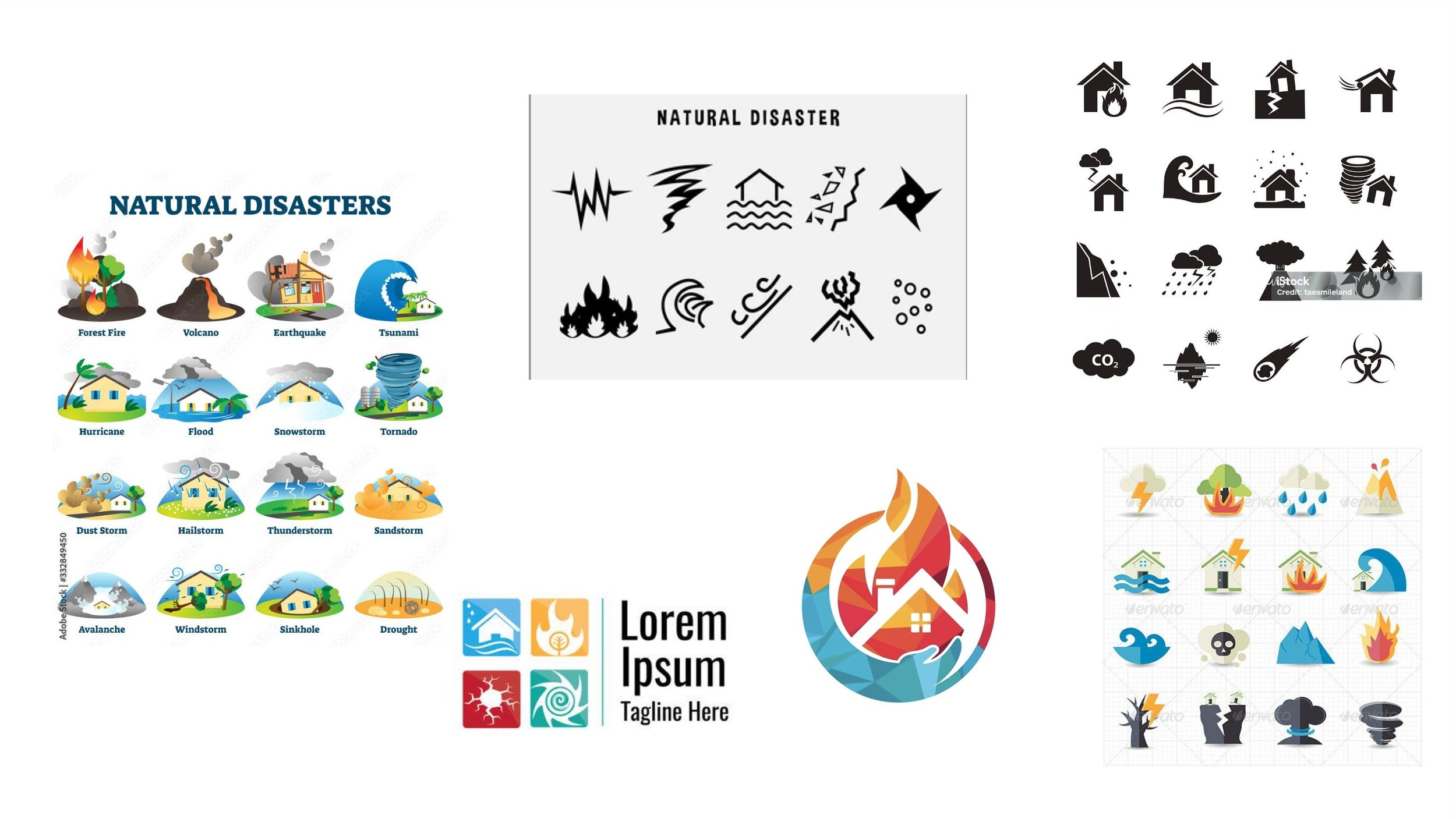
Research

Round 1

Focus on Resistance,
Recovery and Adaptability
with a 2D approach
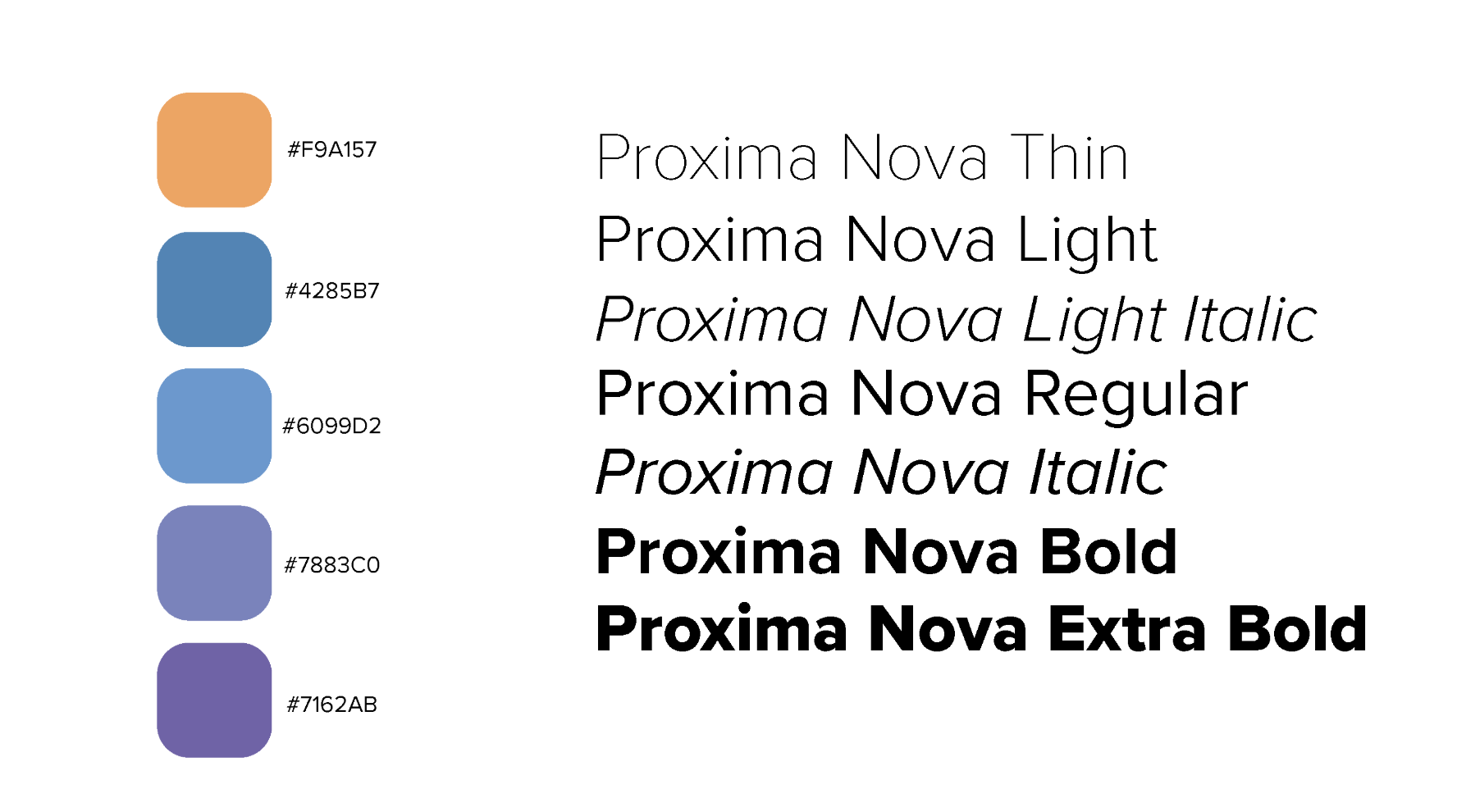
Unifying color palette, Nice
tonal range, not too bright, UF Feel, Negative space, Less
about “Housing” and more
about cityscape, Water
elements are fine, less focus
on destruction, Sustainable
“system”, Circle, arrows, systems
feedback
Round 2
Incorporating more of a
cityscape and focusing
on sustainable “systems.”


Client is interested in a brighter color palette, likes the logo in the top left corner, and the bottom right corner is too challenging to read, including a single-family house to show the diversity of buildings, doesn’t like the
thicker font, experiment with
text going around logo, try different styles of trees
feedback
Round 3

Process:
Color Palette:

Final 4 Variations: